The solution lies in what I like to think of as declaring explicit design and interaction rules.
In this article, you’ll get a deep dive into why explicit design is where the future of our design environments is headed.
I’ll walk you through:
- What constitutes an interface design decision, beyond what most designers encounter inside vector design tools
- An easy and intuitive formula to help convey the decision we intend as designers, in a flexible, responsive and robust way
- How vector tools, code-like tools, and CSS itself allow us to express our desired intent
Let’s dive in.
First: What is the difference between implicit intent and explicit design rules?
To answer this, it’s helpful to start with a question that every product designer can relate to: “How do I get these items over there, to align like this and respond like that to changes in screen width”.
Depending on the design tools you're using, you can find a solution in one of two ways. You can either design examples and variations that express implicit intent, which is common in vector-based tools like Sketch or Figma. Alternatively, you can declaratively design the rules from which infinite examples might arise, a capability primarily found in code or code-like tools such as Webflow, Framer, or Jux. This distinction highlights that while both approaches aim to fulfill your desired intent, code-like tools offer much more intelligent, responsive, and granular ways to express that intent through actual design rules. In the following sections, I’ll be walking through real and practical examples to show you exactly what I mean.
Example: Box elements
Let’s say I want to space five objects out horizontally inside a box, and I want all of them to be spread out evenly from the left to the right side of the box.
If I describe the distance of each element from the top left corner I would be able to get my result visually, but I would be doing it by expressing a lot of specific information about each object.

The downside here is that it doesn’t scale. For example, if the amount of objects increases by one or decreases by one, all but the first item of information I used to describe my layout wouldn’t be relevant. If my box was to grow by 100px - same deal - I’d have to provide new measurements all over again.

The solution to this problem is getting to the broader, bigger picture intent of the action, like: “no matter the size of the box or the amount of elements, space them out evenly from left to right”. To make this intent true, you could use something like auto-layout (in the canvas tools), Flexbox in CSS, or code-like tools.
For auto-layout, it would be: auto in the gap field
in Flexbox, it would be: justify: space-between;
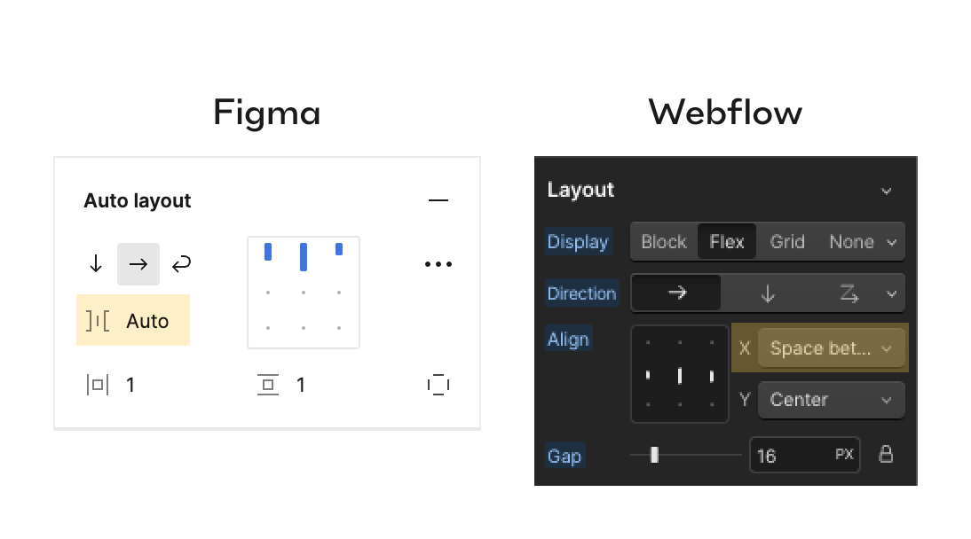
In this case, no matter the width of the screen or the number of items inside the box - the implicit intent correlates perfectly with the explicit rule. And this is exactly how you go from static to dynamic and flexible design.
Direct manipulation vs thinking in rules
Plot twist: Designers love the ability to directly manipulate elements across the canvas, effortlessly moving, rotating, and placing them exactly where desired. This practice enables us to envision concrete examples of how the system might appear if all variables were fixed. From childhood, we're conditioned to perceive 'artboards' as static and finite, similar to posters. However, this mindset conflicts with the reality of designing products, which entails accommodating various screen resolutions, often with unpredictable amounts of content and variations.
So, how should these conflicting approaches be resolved?
Finding the middle ground
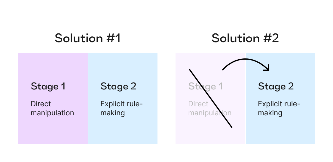
One solution is to let designers have a stage where they can play around, moving and resizing things until at least some key states of the system look decent. Only then would they move to the second stage, where they would try to find the best explicit rules for the result they reached while experimenting, this time across all the possible states.
The second approach would be to expect designers to slowly become so familiar with all the rule-based mechanics that they become intuitive enough for quick experimentation, completely bypassing the need to roam free.
Both are two ends of the spectrum, with every designer intuitively finding the most comfortable place, somewhere in the middle.
Taking advantage of explicit rules
The good news is that with the right tools and application, it doesn’t have to be all or nothing. To understand how explicit rules can be beneficial, it’s helpful to know the kinds of explicit rules an interactive element might have. We can divide them into two categories:
- Self-related, independent visual properties: This can be things like color, border, text properties etc. They tend to not change and not be responsive to screens, resolutions and amount of user data
- Relationship-dependent properties: This can be things like placement inside a parent object, width, height, gap between objects etc. These are the properties this article is going to deal with.
To better explain how these types of properties work, I’ll narrow our focus to the web, showcasing examples across three creation environments:
- Vector-based tools, such as Figma, Sketch, and Adobe XD, which most designers use for designing websites and web applications
- Code-based design tools ike Framer, Webflow and Jux
- CSS
Relationship-dependent: Width, height and their derivatives
It might be tempting to always specify precise and fixed measurements for the width and the height of elements. But it's probably only the right approach when you're certain the element won't change. For example, if we need the button to grow in width based on the length of its text field, we have to make the width ‘dynamic’.
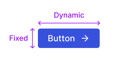
Let’s look at how we’d do this in different tools.
In Figma: This would mean switching the button frame to have auto-layout and choosing ‘hug content’ for width.
In Sketch: You’d have to set the button to have ‘smart layout’ with horizontal resizing.
In Jux and Webflow: You’d set the width field as ‘auto’.
In Framer: You’d have to select ‘fit content’ in the dropdown before the auto becomes accessible.
In CSS: You would make the width: auto
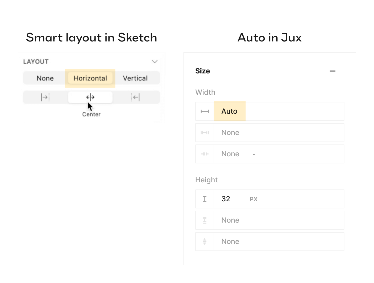
Note that the dynamic ‘undefined’ value for the width of the button is the explicit rule here that will work for all the infinite cases of text.
Four use cases that prove why explicit rules are important
Explicit rules, help you match input or commands with your implicit intent, the directive that will ensure applicability across various resolutions and specifications. Let’s look at four different situations, where the ability to design with greater flexibility, thanks to explicit rules for width and height, proves beneficial:
- I want to have a cap on the width of my button: Let’s say you want to guardrail against a case where the labels on a button are completely out of your control and are user-dependent. Or for example, you don’t want the ‘OK’ button to be as short. In all three platforms, it would make sense to use
min-widthandmax-width. Our implicit intent is now more nuanced: “have a width of however is needed, but not less than X and not more than Y.”

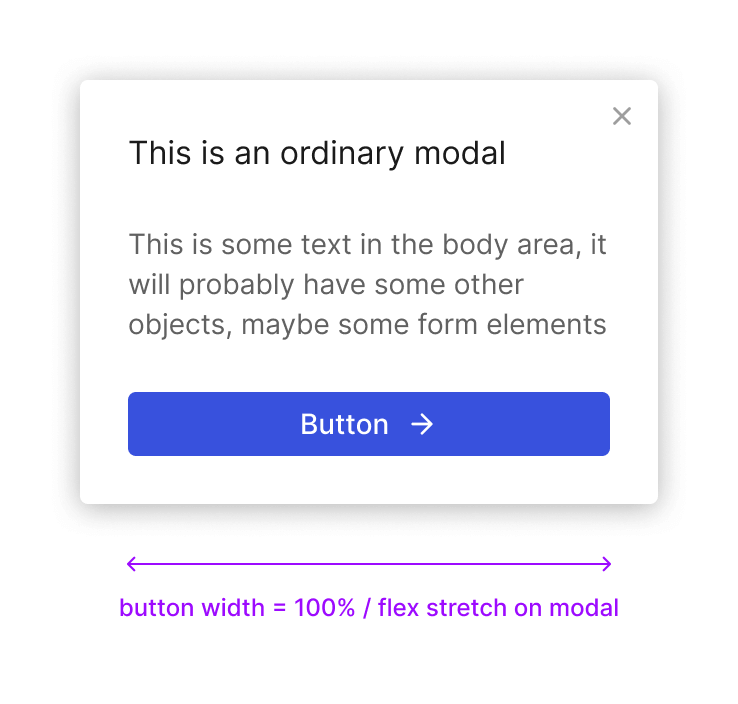
- I want to place the button inside a modal, at the bottom: In this case, the implicit intent would be: “always stretch side to side, no matter what label it has”. To achieve this in Figma, you can use
fill-containeron the button, provided that the modal itself is set toauto-layout. In Jux, you can do it in a couple of ways, either by specifying 100% on the width of the button, or even better - selecting ‘flex’ for the modal and ‘stretch’ in the justify selection. In CSS, you can use percentage or flexbox.
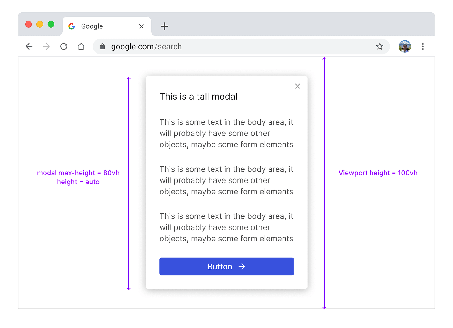
- I want to limit the modal from being taller than 80% of the height of the viewport: In this case, the implicit intent would be: “Grow height up to fit the content until you hit 80% of the viewport height and then stop”. Viewports come in many sizes. In Vector tools - you’re out of luck. There’s nothing you can specify as an explicit rule.. In code-like tools, you can specify an
80VH(viewport height) unit on the max-height of the modal, while leaving the height itself onauto.
- I want the modal to be divided up into 3 columns with different ratios of their widths: Here, the implicit intent would be something like: “Divide into three columns, make the width of the first column 30%, the second 50% and the third 20% of the container width, and a 16px gap between them”. In this case the width of each column cannot be fixed, but it also cannot be ‘
auto’.

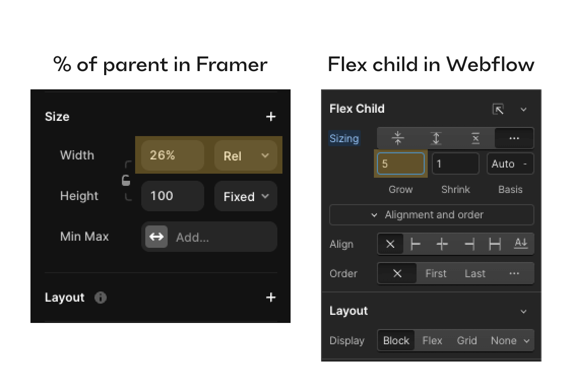
To specify an explicit rule in Sketch, Xd, or Figma, there’s really nothing you can do for that to work responsively. In Framer, for example, you can use a percentage unit on the width of each column by choosing relative in the dropdown. In Webflow, you can use Flexbox on the modal and specify the ratio using flex: grow number on the columns to adjust the ratios.
In CSS and in both Framer and Webflow you can also use grid on the modal and specify each column's ratio using the fr unit (which stands for fraction), all while keeping the width of the modal on auto. Either of these solutions is a nuanced but powerful explicit design rule.
This concludes Part 1.
In Part 2 we will dive deeper and see how layout order, position, padding and margin also benefit from flexible and explicit design rules.

.png)
.png)

.png)